
Happy Saturday! Today I'm going to share a simple tutorial to show how to colour red. It can be a tricky colour to do. Before I start I must point you all towards Alyce at Kit and Clowder I've learned so much from taking Alyce's classes. I've coloured for years but Alyce helped me to further my colouring, showing me how to add more depth and detail.
I found a free clipart image of a santa hat to do this tutorial -


So these are the reds - using Copics.

I start by putting the darkest red. I want the hat to appear round. So putting the darkest in these areas will help to create this look. It'll make more sense at the end!

I add the medium red going over the darkest and bringing this red further into the hat.

Then I use the lighter red to blend over the top of these colours leaving a white area where I want the hat to be the lightest.
This first layer is mapping out the areas of light and dark. I didn't even use all of my reds I just chose the dark, medium and light for this mapping layer.
Now the next layer -

I use the 2nd darkest red bringing it much further into the hat. The problem with red is that if you use more of the lightest it can appear pinker than you want.

I used the medium red to blend this again leaving a small white area.

The lightest red I just used to blend into the white I didn't go over any of the dark areas this time as I didn't want to desaturate the red.
Okay so the hat looks good but I want to add more depth so I use a dark grey. Greys are fabulous for adding to any colour. If you choose a grey that is slightly darker than your darkest colour it will blend nicely.

I chose C7 and added it only to the very darkest areas being quite precise to only add it to the areas that will enhance shape.

As before I worked through my reds to blend the grey out. I'm left with a nice red hat that has depth and shape.
So now I want to create a fluffly bobble and trim.
To do this I use my greys & blender.


So I use dots, don't press too hard as you want small dots. Adding the darkest grey first I go around the edge.

I go over the darkest with the medium grey. Creating dots of different sizes working further into the trim and bobble.
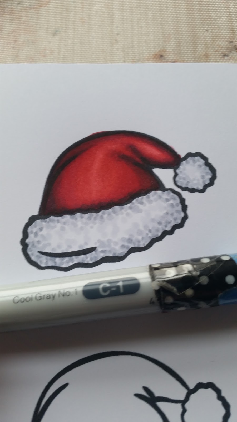
The lightest grey covers the other 2 blending. However I try not to blend every dot as I need the different tones to create shape.

I use my blender to smooth out the lightest areas. As you can see the trim and bobble now look fluffy and have shape.

I usually add some sparkle too!!
The ideas here work with any colour. If you map our your image using a dark, medium and light you will create shape. By adding further layers and depth creates an image that looks more 3D.
Hope this helps. I will be back with further ideas.
Take care Zo xx
3 comments:
WOW, Zoe! You make it look so easy, thanks for the tutorial. xx
Wonderful tutorial - TFS
brilliant work, Zo great to see the step by step shots thanks for sharing, Shaz in Oz.x
Post a Comment